Translate

Saturday, March 23, 2024

HARLEM RENAISSANCE EXHIBITION AT METROPOLITAN MUSEUM 3/23/24


I squeezed my way into the Metropolitan Museum's HARLEM RENAISSANCE exhibition sidling past a crushing crowd of onlookers. I panicked and wanted to rush out barely being able to see the work- which made me whisper to my friend, "I gotta leave - hard to breathe..." Besides my Covid phobic masked face was a peculiarity in this environment. Yet, I was fascinated by the diversity of color, ethnicities, ages, etc that were discussing and viewing the art. FINALLY, I muttered to myself these artists and paintings are being seen. Most of the works in the show involve figuration and narration executed in various modes and techniques. Some were done in the period of Modernism when large abstract paintings were dictated by the critic Clement Greenberg as the supposed “march of history” thereby ignoring a whole slew of artists and their profound works.

I have been looking at William H. Johnson’s art for many years and expressly came to this exhibition to see his paintings which jumped out at me like a fresh breeze whenever they appeared in a room. His work, imbued with joy and humanity through a uniquely flat, patterned and colorful style is a penetrating look at his African American community infused with flecks of whimsy that never disappoint. Paintings of his parents, family narratives, children delighting in the playfulness of living, as well as adults dealing with life’s vicissitudes are permeated with compassion.
Another artist, Winold Reiss, whose beautifully rendered pastels (having spent 10 years of my own life exclusively drawing with pastels/canvas) of Native Americans and African Americans continues to dazzle me with his combination of incisive dexterity intertwined with a piercing search into his subject’s being.
“…Winold Reiss was a German-born American artist and graphic designer. He was born in Karlsruhe, Germany. In 1913 he immigrated to the United States, where he was able to follow his interest in Native Americans. In 1920 he went West for the first time, working for a lengthy period on the Blackfeet Reservation…Reiss illustrated Alain Locke's historic 1925 anthology The New Negro, an important book about African American culture at the time of the Harlem Renaissance. These included drawings of such key figures as W. E. B. Du Bois, Charlie Johnson (bandleader), and Elise Johnson McDougald. ( Wikipedia)
Some names in HARLEM RENAISSANCE have become very familiar to us such as Jacob Lawrence, Archibald Motley, and Romare Bearden among others, who are represented in the show. Bearden’s THE BLOCK fills one whole room with 6 ambitious panels allowing for the viewer to experience a NYC street with its neighborhood stores, apartment buildings, and residents - some leaning out the windows, others participating in the drama of street life - engaging in the breath and energy of Harlem’s march of existence.
In 2015 I went to the Whitney Museum to see Archibald Motley (18891-1981): Jazz Age Modernist - a surprising discovery for me of paintings that are an uneven mix of sensitive portrait studies of family members, blatantly brash, wild hues and other canvases where forms are butting up against one another like a dance, creating tension so tight there is no room to breathe - filled with extravagant gesticulations indicative of the explosive Jazz Age era. All seen through the eyes of a man who articulated the movement through the medium of paint in 1920's Chicago.
I adore opening up to artists whose body of work I barely know - giving me a sense of their person and the times they lived in - a real treat.
Many of Motley's paintings are in this show.
HARLEM RENAISSANCE is a large exploration of a vital and historically influential period of our time. I recommend a visit and enclose some links and images with wall labels. Use arrows to navigate imagery.
Enjoy!


Sunday, December 31, 2023

BARBIE 12/31/23


L. Margot Robbie  R. Ryan Gosling

Just finished seeing the overblown, overhyped film Barbie - I tried twice before and had to turn it off - I was so repelled - so tonight I decided to attempt again to see it through to the end. Hooray - I did just that and alas my original perception was never challenged as Ideas and even musical numbers were flattened out as if steamrolled into their hairline dimension by a Gerwig/ Baumbach screenplay. 

 Sure the graphics and costumes are cute and so are the Barbies and Kens, but this is a shallow, cliched movie - using war-between-the-sexes "word-speak" language to talk about the faults of a Patriarchy vs. the strength and beauty of a Matriarchy both of which are portrayed with pure Hollywood glitz. "Stereotypical Barbie" acted by Margot Robbie is as stereotypical as the film devoid of any emotion. The movie characters are plastic, smoothed to the touch physically, and leveled to the ground like talcum powder.

 I was a Ryan Gosling fan but jeez in order to see him again I will have to erase his loopy KEN performance from my mind's eye. 

 If this is considered a "feminist film" I would re-evaluate what people think Feminism is today. Is it PINK?

Tuesday, December 19, 2023

KATHARINE KUHARIC EXHIBITION "THE FOLIATED ROOM" AT PPOW GALLERY

                        Katharine Kuharic at PPOW

THE FOLIATED ROOM 12/15/23 - 1/27/24


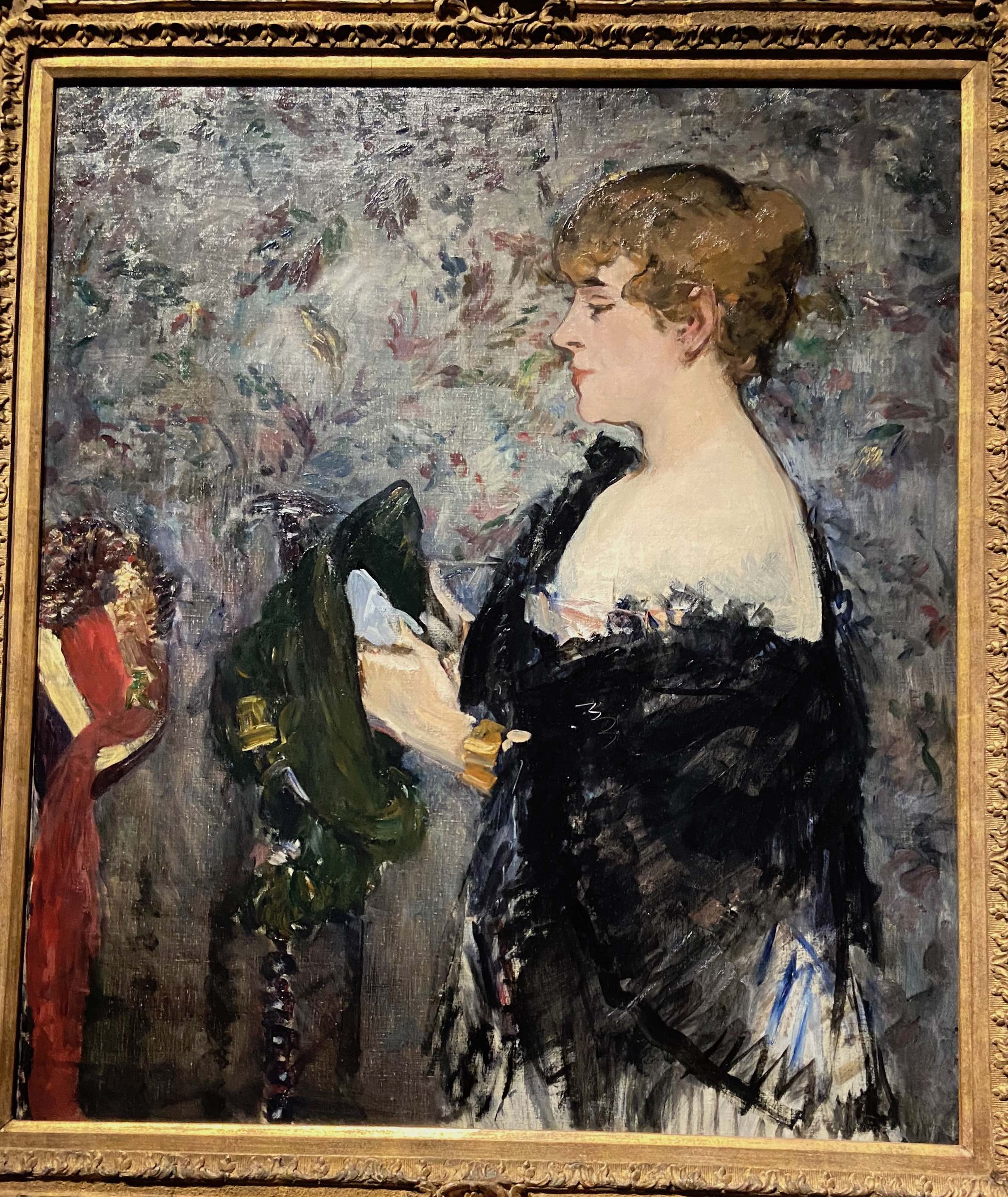
Cenotaph, oil/linen, 40x60inches, 2020


I spend days walking around looking at art and am rarely inspired to examine what I see. Rarely do my flitting eyes widen becoming a leash tightening around my neck pulling me towards work transmuting into a face-to-face intimacy as I closely examine what so attracted me. My taste is very broad as I am not frozen in one style - artworks must bleed a presence that exudes sensitivity and individuality resulting in beauty - be it a shout or a whisper that touches my gut and conscience. Always a rare occurrence but Katharine Kuharic’s exhibition will be affixed to my memory.


I walked into PPOW Gallery and I saw color - closely hued tonalities from a vast spectrum of pigments - some were complementary colors, but so closely hued that I thought of Gauguin and his flattening of space through disparate colors creating lyrically harmonic paintings. Once I got close to the work I saw the camouflaging of imagery done with a hand that was so delicate that I became lost in the patterning. Kuharic’s touch is light and fragile but always sensual as if she were tenderly wrapping her fingers around the subject matter - be it foliage or hidden birds waiting to emerge through time and our apprehension of them.


Like her early paintings, mortality is a constant theme intertwined with the awareness not only between growth and decay but how climate change further impacts our Universe. In some recent works, beautifully painted realistic images of a kitten - no longer obscured - come to the foreground gazing at us with a wistful gaze as if to question what we the caretakers have done to our sacred land. Often black and white birds float in the sea of color like witnesses to the defilement of nature’s beauty. And yet these paintings have an optimism akin to the sublime radiance of jewel-like treasures.


Burst Forth, oil/linen, 10x8 in. 1993


Perch, oil/linen 12x9 inches, 2023

Sentinel, oil/linen, 60x40, 2021


Tangle, oil/linen,14x11in. 2023


Virginia Creeper, oil/linen, 16x12 in. 2023


Tabernacle of Tears, oil/linen, 40x60,2019

Detail: Tabernacle of Tears, oil/linen 2019


Detail: Tabernacle of Tears oil/linen 2019


Friday, November 10, 2023

ARTISTIC PRECEDENCE IN "OLD MASTER" PAINTINGS


I often go to see great “masters” for reasons that are not about beauty, innovation, transcendence, etc. but rather to find their “mistakes”, slip-ups, sloppiness, laziness, and pure incompetency that reinforce my idea - especially in regard to representational painting - that NO ONE is a “perfect painter”, even if all the art history books say so, and declare that those old guys and gals achieved excellence. Ingres is a great
example - beautiful drapery with noodle fingers delicately placed on sumptuously painted fabrics.
Too many years of teaching and developing my eye cannot be shut off when I “eye” major exhibitions - So here goes with the terrific - yes still terrific - Manet/Degas pairing show at The Metropolitan Museum of Art.
There are many images here and some paintings are wonderful just as they are, and I include them. Manet knocked out Degas in the 3rd round but Degas still got in some punches not that there was a competition though the Met might have handled it that way - making them competitors thematically. Manet has a luminosity and serpentine hand that can dance and punch its way around a canvas. Degas is softer - these oil paintings show why he loved pastels so much - they began crisp and became fuzzier around the edges as he developed - blending into the background. They both employ narrative and in my opinion, could have been edited….but alas I was not around almost two centuries ago.
With these photos (which include wall labels and details) I apologize for being too lazy to edit or remove the glare to peak culmination, I show some of the painting gaffes that distracted me. Manet loved to smush out a toe and fingers here and there; Degas would allow a pant leg to be as flat as an ironing board; canvases were literally torn /sliced away from the original works and I believe Manet just got too bored to finish up the less finer point of a piece. Also interestingly Manet was not afraid of using dark tones in even the whitest of draperies, but rarely would he model a person's particularly a woman’s face with darker tones. so some of his greatest depictions of women are very pale and delicate. The exception is a great Berthe Morisot portrait.
I loved seeing the show - don’t get me wrong - but I also love to search for the eccentricity and the humanity in the work.